• DESIGN AND STRATEGY IN FLOW • CRAFT • CONVERSATION • CLARITY
• DESIGN AND STRATEGY IN FLOW • CRAFT • CONVERSATION • CLARITY

We approached the packaging with two priorities.
Clarity and familiarity.
Karachi
Packaging design & Digital Marketing
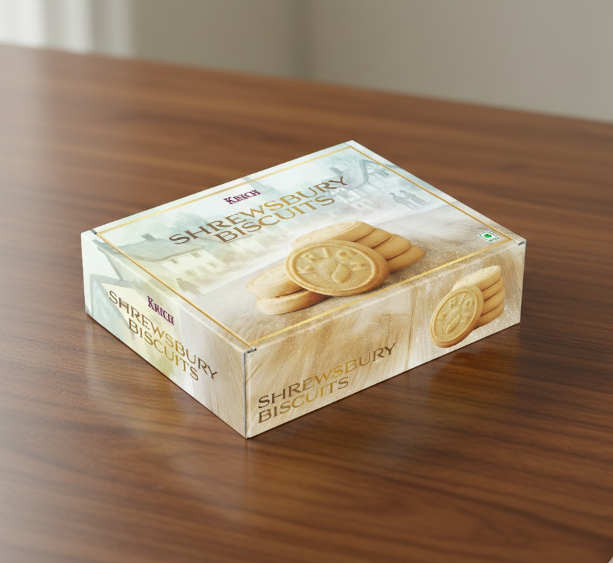
Each variant was designed to be visually distinct while still belonging to a consistent family. Product imagery was made central to the design to highlight texture and freshness. Typography was kept bold and readable so customers could recognise the product instantly.
Visual cues were chosen to match the personality of each biscuit. Shrewsbury biscuits carried a more classic tone, fruit biscuits leaned into ingredient cues, and choco chip cookies emphasised indulgence. At the same time, the overall layout and brand placement remained consistent across the range.
Shree Mohan’s Karachi Sweet Mart is a brand built on familiarity and trust. For generations, customers have associated the name with reliable taste and traditional recipes.
When designing packaging for the biscuit range, the goal was not to reinvent the brand. Instead, the task was to strengthen shelf presence while staying true to the identity people already recognise.
The problem:
Mass-market biscuit shelves are crowded and highly visual. Products compete through colour, imagery, and instant recognisability. At the same time, the packaging needed to remain aligned with the Karachi Sweet Mart identity and appeal to a wide audience.
The challenge was to create packaging that felt inviting and appetising while retaining the warmth and accessibility associated with the brand.
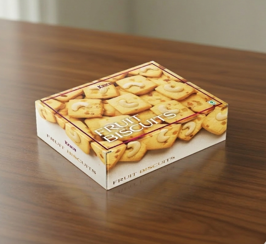
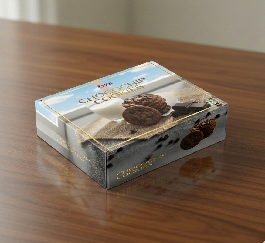

The final packs allow the biscuits to stand out clearly on shelf while maintaining the identity customers associate with Karachi Sweet Mart. They feel approachable, appetising, and familiar.
More importantly, the system provides a repeatable structure for future biscuit flavours, allowing the range to grow without losing visual consistency.
• DESIGN AND STRATEGY IN FLOW • CRAFT • CONVERSATION • CLARITY
brewbanter.in@gmail.com
+91 7378759285 | 9284728696
© 2026 Brew & Banter
All rights reserved.