• DESIGN AND STRATEGY IN FLOW • CRAFT • CONVERSATION • CLARITY
• DESIGN AND STRATEGY IN FLOW • CRAFT • CONVERSATION • CLARITY

Our approach was guided by a simple question.
How do you make Indian frozen food feel confident, modern, and export-ready without losing its cultural grounding?
cue an extensive Dubai Study
THE CHALLENGE:
.png)
Krich in Dubai
Market Entry & Study
Packaging Design
Right off the bat we knew that audience was broader, the shelf was busier, and purchase decisions were faster. In this environment, we realized packaging does more than carry information. It signals quality, origin, and trust in a matter of seconds. The challenge was to design packaging that stood out through clarity rather than clutter, communicated product type instantly, and felt credible to both Indian diaspora buyers and a wider international audience.
Krich’s frozen products range marked the brand’s first step into an international retail market. With parathas and samosas entering highly competitive freezer aisles in Dubai, the brand faced a different set of expectations than it did at home.
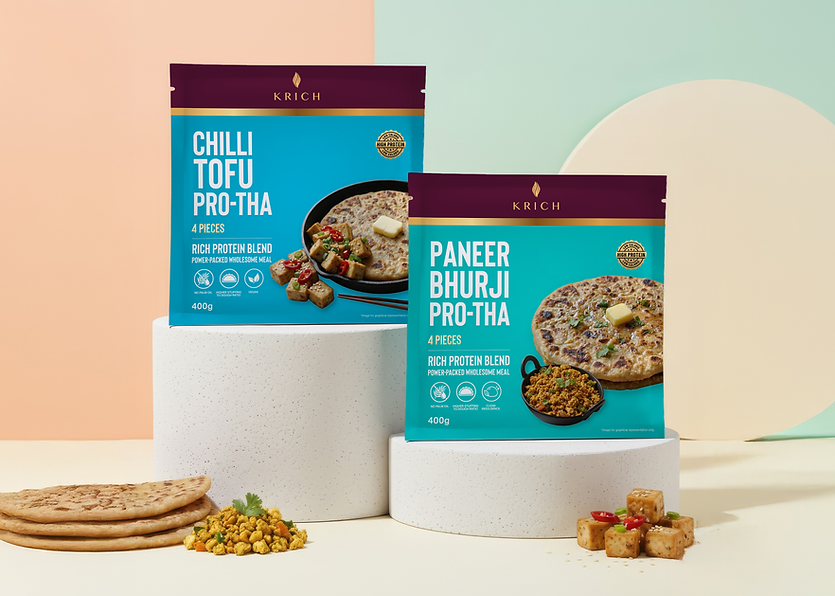

We began with a Dubai-focused shelf and competitor study, analysing colour usage, visual hierarchy, language cues, and product photography across parathas and samosas. This informed a packaging system built around strong readability, controlled colour palettes, and clear product differentiation.

Frozen food aisles in Dubai are dense with global and regional brands. Many rely on loudness, legacy, excessive claims, or overstyled visuals to grab attention. For Krich, blending into that noise was not an option. To truly stand out we first needed to understand the audience.
Building a brand identity which lasted even after the final bite
The design prioritised appetite appeal and quick recognition. Product visuals were given prominence, typography was kept bold and legible from a distance, and unnecessary claims were stripped away. Cultural cues were retained subtly, allowing the packaging to feel Indian in origin without leaning on stereotypes.
The frozen range packaging helped position Krich as a composed and dependable brand in an unfamiliar market. It allowed the products to hold their own alongside international players while remaining recognisable to consumers seeking familiar flavours.
More than a visual refresh, the system created a scalable foundation for future categories and markets, ensuring the brand could expand without redesigning its identity every time it crossed a border.
• DESIGN AND STRATEGY IN FLOW • CRAFT • CONVERSATION • CLARITY
brewbanter.in@gmail.com
+91 7378759285 | 9284728696
© 2026 Brew & Banter
All rights reserved.